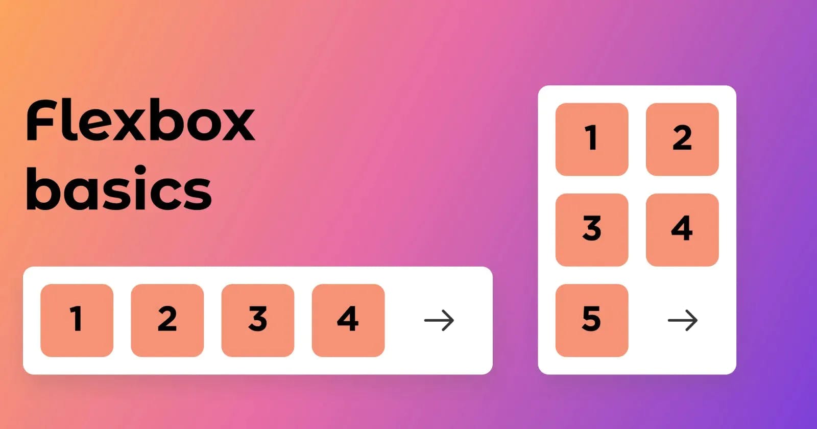


What is Flexbox? 🤔💭
Flexbox is a layout model that enables efficient and dynamic element arrangement. This one-dimensional layout allows elements to be placed inside a container with evenly distributed space.
This layout makes elements responsive, which means they change their behaviour depending on the type of device that is displaying them. It gives elements flexibility as well as appropriate position and symmetry.
Terminologies :
Flexbox is an entire module rather than a single property, it involves several different things in addition to its entire set of properties. Some of them should be placed on the container (parent element, also known as "flex container"), while others should be placed on the children (also known as "flex items").
main axis
The main axis of a flex container is the primary axis along which flex items are laid out. The main axis direction is defined by flex-direction, the default direction is left to right
cross axis
The axis perpendicular to the main axis is called the cross axis. Its direction depends on the main axis direction.
cross-start | cross-end
Flex lines are filled with items and placed into the container starting on the cross-start side of the flex container and going toward the cross-end side.
Flexbox Elements
To start using the flexbox model, we first need to define a flex container.
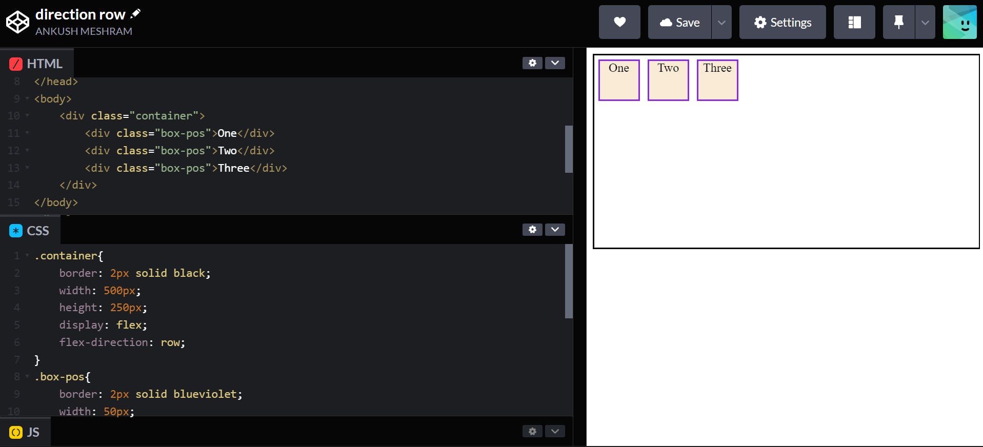
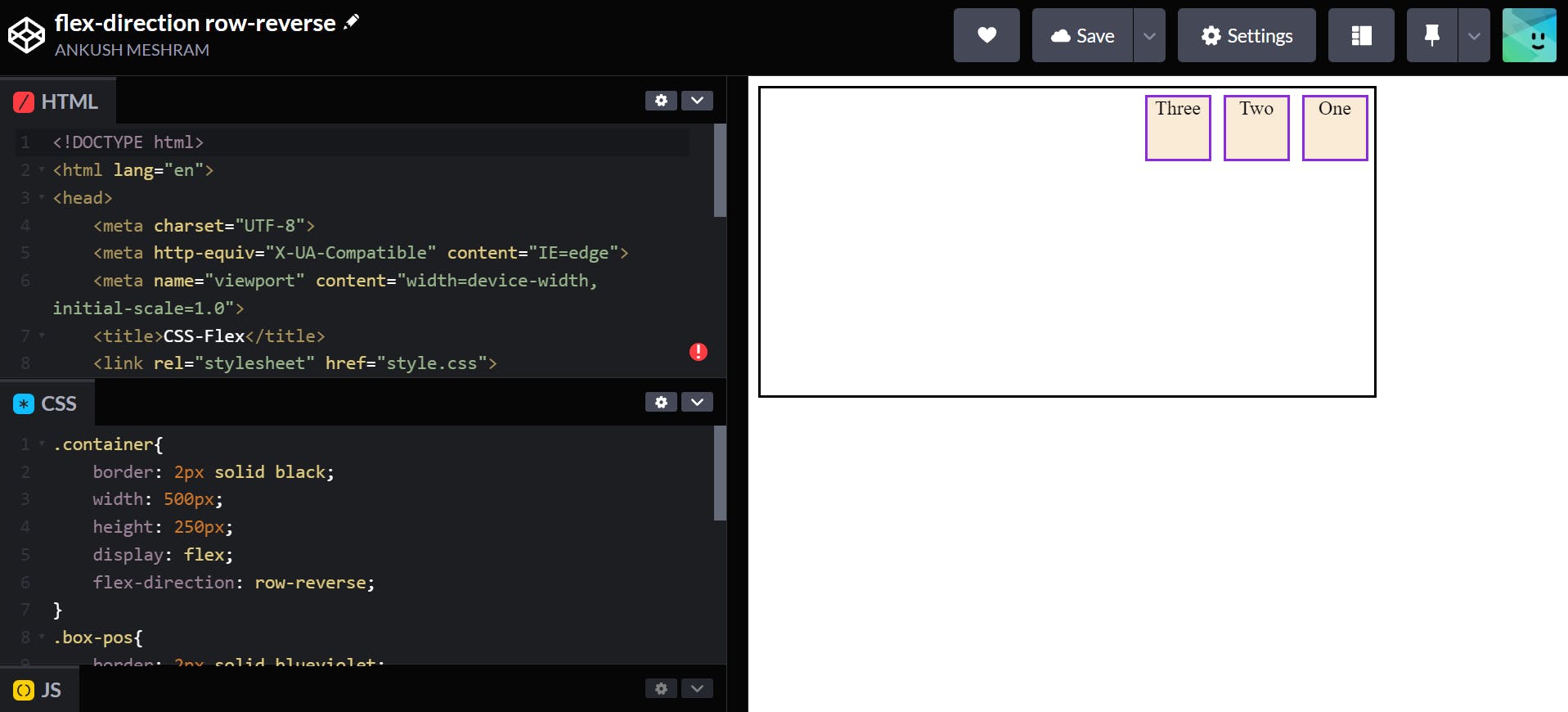
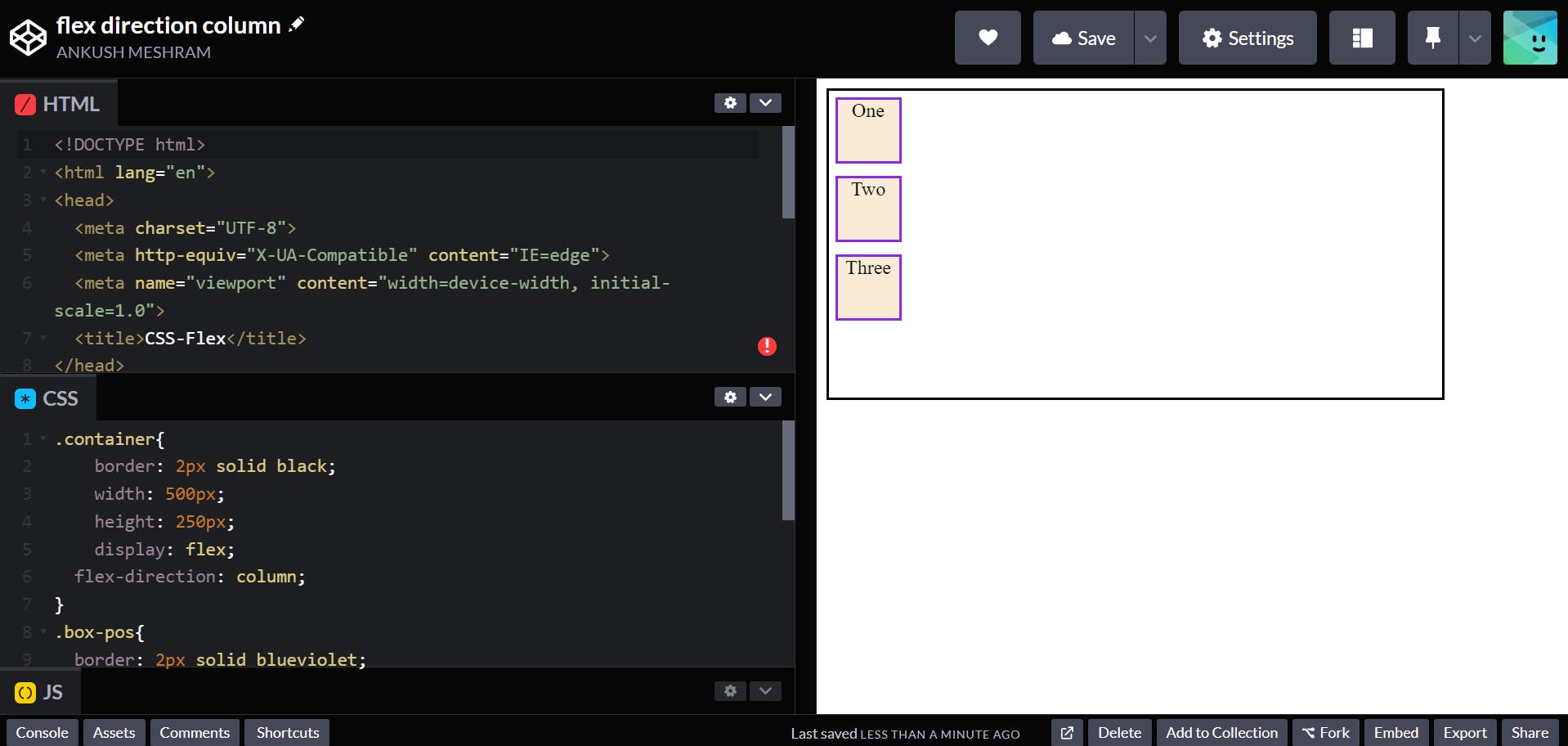
<div class="container">
        <div class="box-pos">One</div>
        <div class="box-pos" id="two">Two</div>
        <div class="box-pos">Three</div>
    </div>
Flexbox Properties
👉 Display property:
The flex container become flexible by setting the display property to flex
.container{
    display: flex;
}
- Output:-
👉 flex-direction property:
The flex-direction defines the direction of the container. It has several Properties namely:
row (default):
left to right, right to left.container { display: flex; flex-direction: row; }Output:-
row-reverse:
right to left, left to right.container { display: flex; flex-direction: row-reverse; }Output:-
column:
same as row but top to bottom.container { display: flex; flex-direction: column; }Output:-
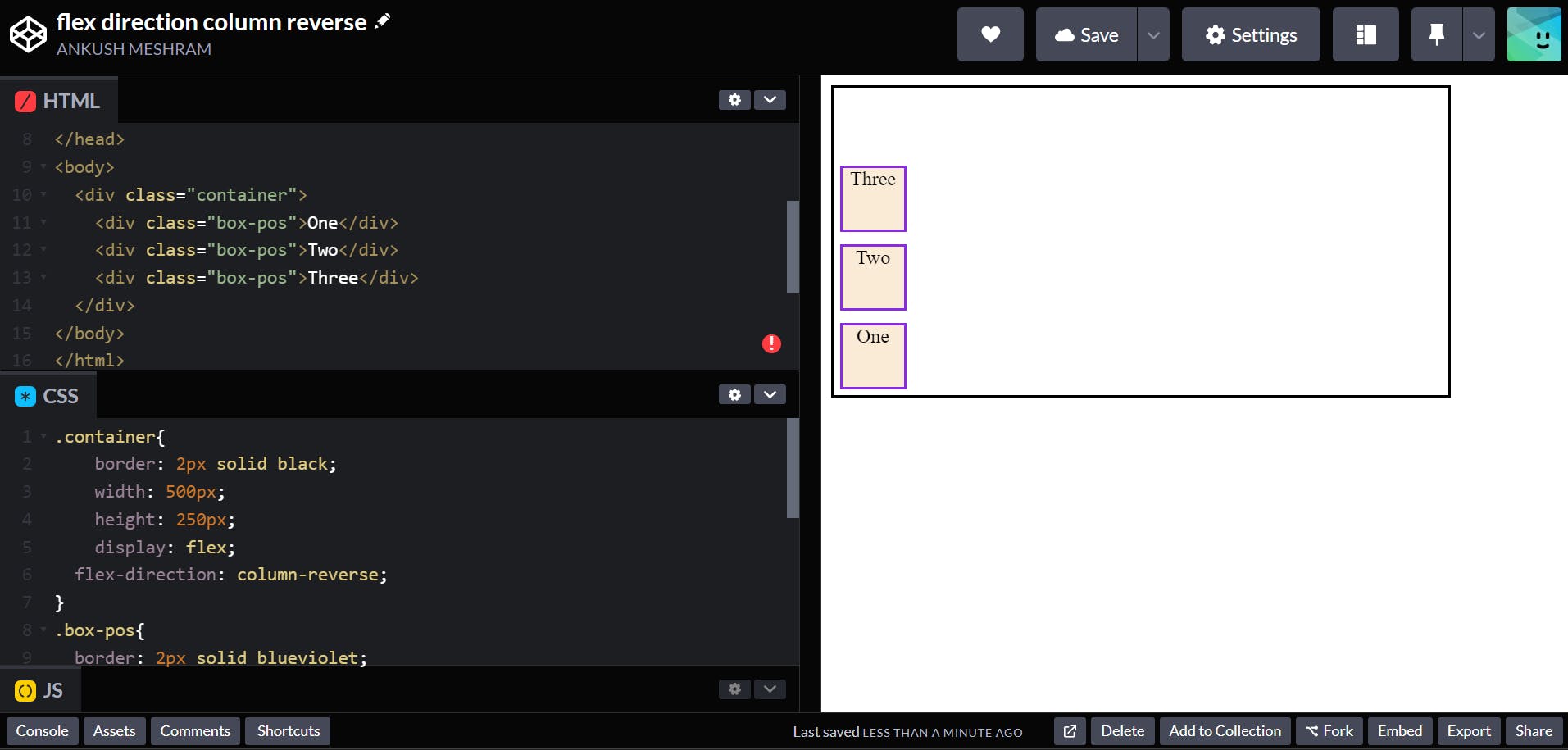
column-reverse:
same as row-reverse but bottom to top.container { display: flex; flex-direction: column-reverse; }Output:-
👉 flex-wrap property
By default, flex items will all try to fit onto one line. You can change that and allow the items to wrap as needed with this property.
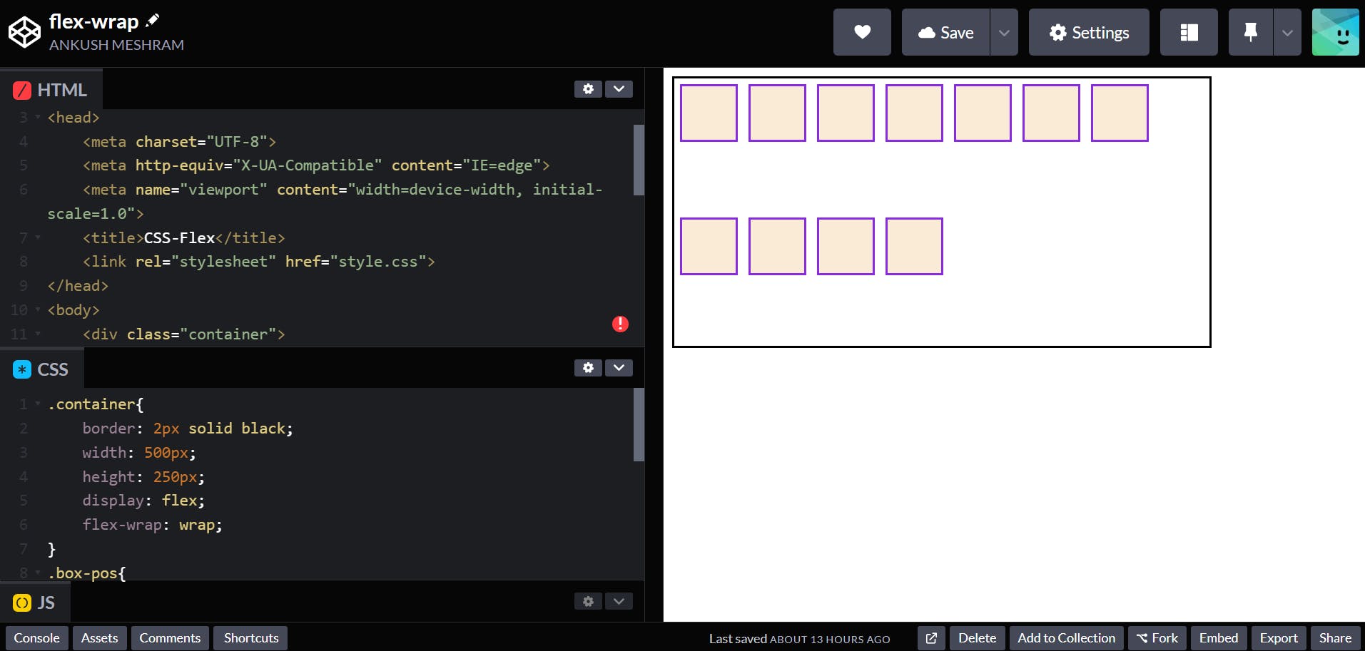
wrap
flex items will wrap onto multiple lines, from top to bottom..container { display: flex; flex-wrap: wrap; }Output:-
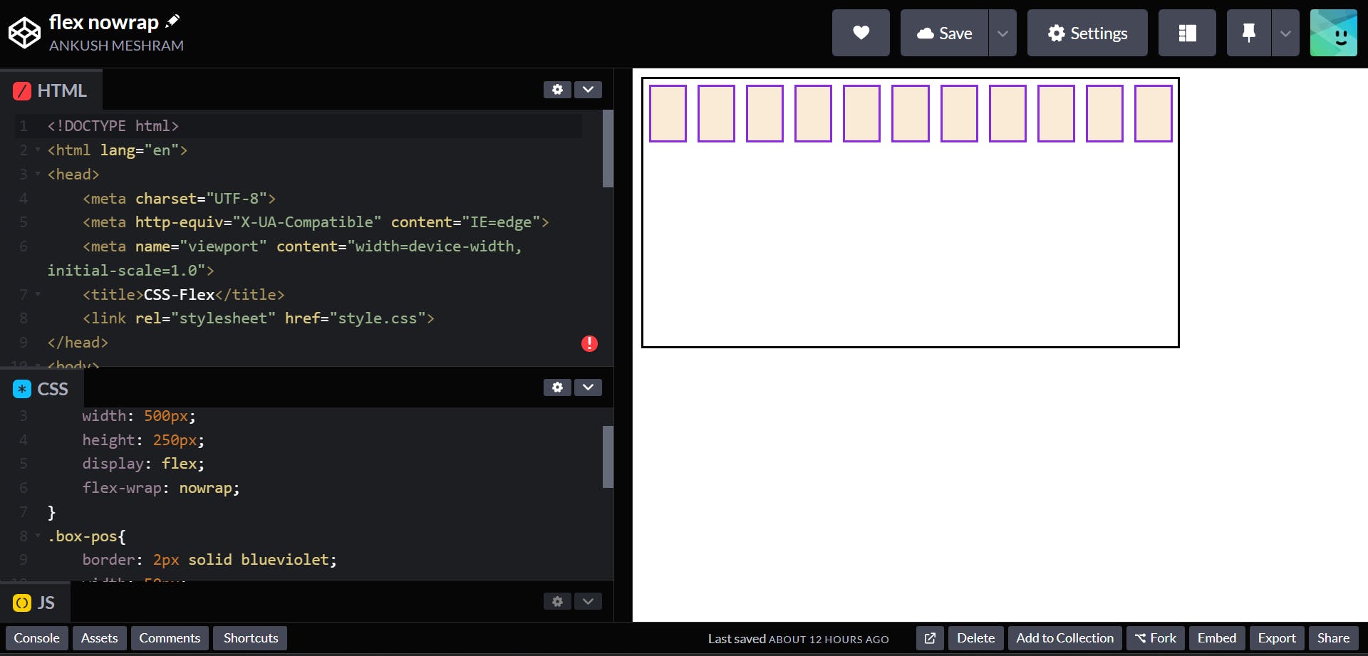
- nowrap
all flex items will be on one line
.container {
  display: flex;
  flex-wrap: nowrap;
}
Output:-
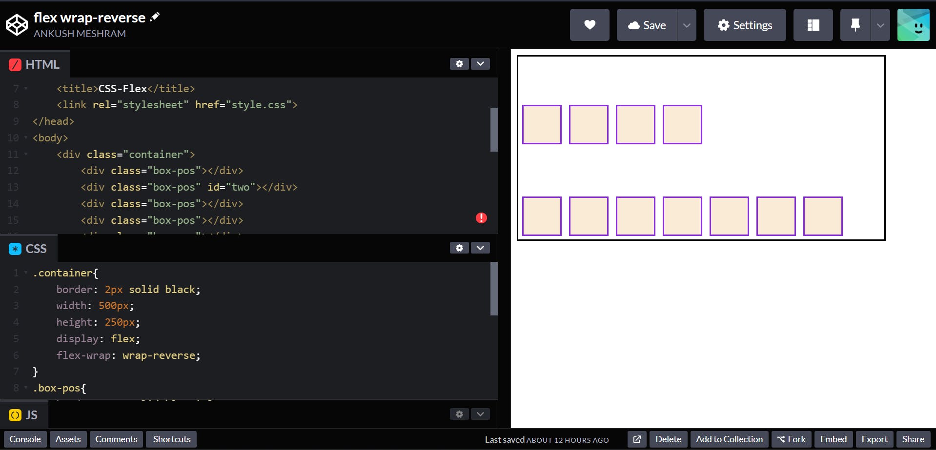
- wrap-reverse
flex items will wrap onto multiple lines from bottom to top.
.container {
  display: flex;
  flex-wrap: wrap-reverse;
}
Output:-
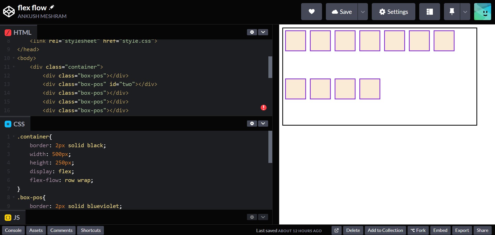
👉 flex-flow property
This is a shorthand for the flex-direction and flex-wrap properties, which together define the flex container’s main and cross axes. The default value is row nowrap.
.container {
  display: flex;
  flex-flow: row wrap;
}
Output:-
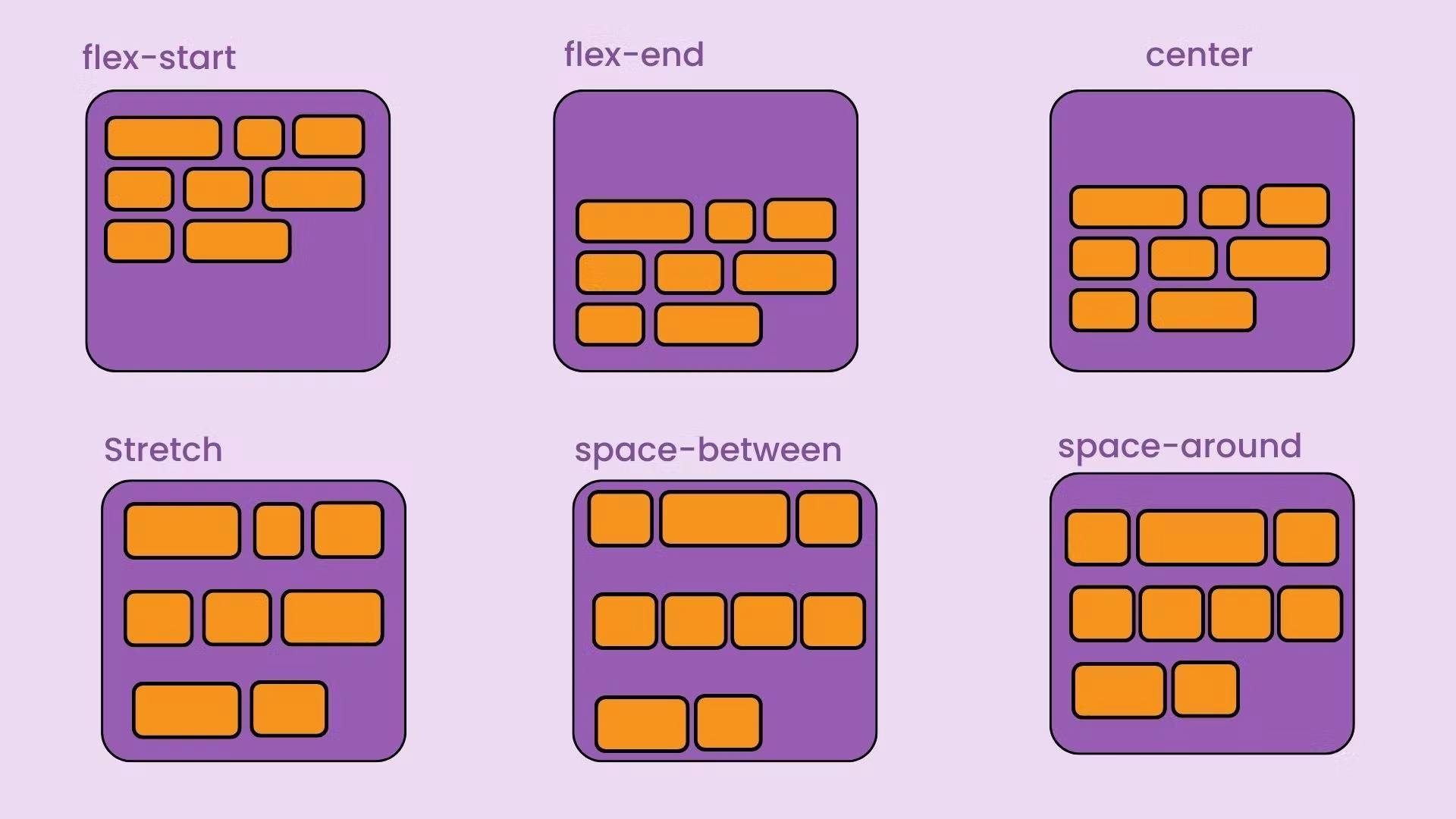
👉 justify-content property
This defines the alignment along the main axis. It helps distribute extra free space leftover when either all the flex items on a line are inflexible, or are flexible but have reached their maximum size. It also exerts some control over the alignment of items when they overflow the line.
center
items are centered along the main axis.container { display: flex; justify-content: center; }Output:-
flex-start
items are packed toward the start of the flex-direction..container { display: flex; justify-content: flex-start; }Output:-
flex-end
items are packed toward the end of the flex-direction..container { display: flex; justify-content: flex-end; }Output:-
space-around
items are evenly distributed in the line with equal space around them..container { display: flex; justify-content: space-around; }Output:-
space-between
items are evenly distributed in the line; first item is on the start line, last item on the end line.container { display: flex; justify-content: space-between; }Output:-
space-evenly
items are distributed so that the spacing between any two items (and the space to the edges) is equal..container { display: flex; justify-content: space-evenly; }Output:-
👉 align-items property
This defines the default behavior for how flex items are laid out along the cross axis on the current line. Think of it as the justify-content version for the cross-axis (perpendicular to the main-axis).
center
items are centered in the cross-axis.container { display: flex; align-items: center; }Output:-
flex-start
items are placed at the start of the cross axis. The difference between these is subtle, and is about respecting the flex-direction rules or the writing-mode rules..container { display: flex; align-items: flex-start; }Output:-
flex-end
items are placed at the end of the cross axis. The difference again is subtle and is about respecting flex-direction rules vs. writing-mode rules..container { display: flex; align-items: flex-end; }Output:-
stretch (default)
stretch to fill the container (still respect min-width/max-width).container { display: flex; align-items: flex-end; }Output:-
baseline
items are aligned such as their baselines align.container { display: flex; align-items: flex-end; }Output:-
align-content
This aligns a flex container’s lines within when there is extra space in the cross-axis, similar to how justify-content aligns individual items within the main-axis.
.container {
  align-content: flex-start | flex-end | center | space-between | space-around | space-evenly | stretch | start | end | baseline | first baseline | last baseline + ... safe | unsafe;
}
- normal (default): items are packed in their default position as if no value was set.
- flex-start / start: items packed to the start of the container. The (more supported) flex-start honors the flex-direction while start honors the writing-mode direction.
- flex-end / end: items packed to the end of the container. The (more support) flex-end honors the flex-direction while end honors the writing-mode direction.
- center: items centered in the container
- space-between: items evenly distributed; the first line is at the start of the container while the last one is at the end
- space-around: items evenly distributed with equal space around each line
- space-evenly: items are evenly distributed with equal space around them
- stretch: lines stretch to take up the remaining space
gap, row-gap, column-gap
- gap: The gap property sets the gaps between rows and columns.
- row-gap: The row-gap property sets the size of the gap between an element's rows.
- column-gap: The column-gap property sets the size of the gap between an element's columns.
GitHub link
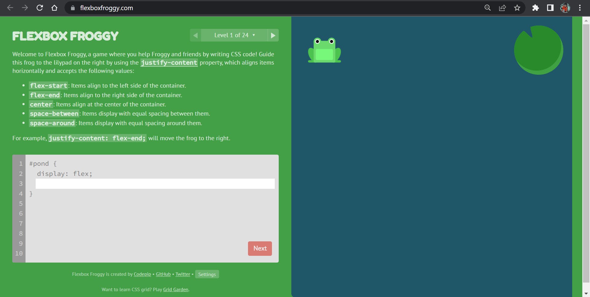
How to practice Flexbox?
For practicing Flexbox, there is a game named Flexbox Froggy
For more visit Flexbox MDN Docs
Hope you have enjoyed🎉 learning about CSS Flexbox!💫