Introduction to CSS Grid
An in-depth series on building responsive layouts with Grid.


What is CSS Grid
The CSS grid is a newer standard that makes it easy to build complex responsive layouts. It allows you to turn an HTML element into a grid(rows and columns). It's purpose is same like flexbox to reposition the HTML elements into the webpage. But apart from the CSS flexbox, CSS Grid is two-dimensional entity.
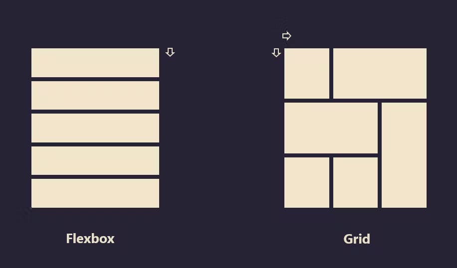 This is how GRID is different from the FLEXBOX by the ability to create multiple layouts with one grid container.
Turning HTML into Grid:
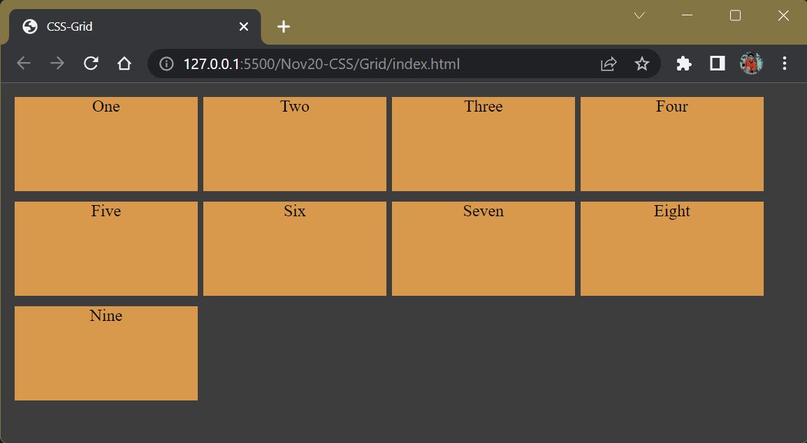
Turning an HTML element into grid is easy. You just have to set the display to grid. In the grid system, the parent is referred to as container and the children are called items.
.container{
     display: grid;
}
Columns and Rows in Grid:
To add columns you need to use the grid-template property. It is used to create rows or columns.
Grid Template Column:
.container {
  display: grid;
  grid-template-columns: 200px 200px 200px 200px;
}
Grid Template Row
.container {
  display: grid;
  grid-template-columns: 200px 200px 200px ;
}
The repeat() function
If you find yourself repeating units, you can use the repeat() function to shorten the property. Earlier we created a grid with four columns using grid-template-columns: 200px 200px 200px 200px, with the repeat function you can write this in a shorter way. EXAMPLE:
.container {
  display: grid;
  grid-template-columns: repeat(4, 200px);
}
CSS UNITS
After setting your display to grid. The items in the container are automatically aligned. You can use the usual units on grid like px and em to show how you want them to be. There are also grid units like
fr: sets the column or row to a fraction of the available space.
auto: sets the column or row to the width or height of its content automatically.
%: adjusts the column or row to the percent width of its container.
.container{
     display: grid;
     grid-template-columns: auto 50px 10% 2fr 1fr;
}
Grid Gap
The grid gap template is used to create gaps or spaces between rows and columns.
.container{
     display: grid;
     grid-template-columns: 50px 2fr 2fr 1fr;
     grid-column-gap: 10px;
}
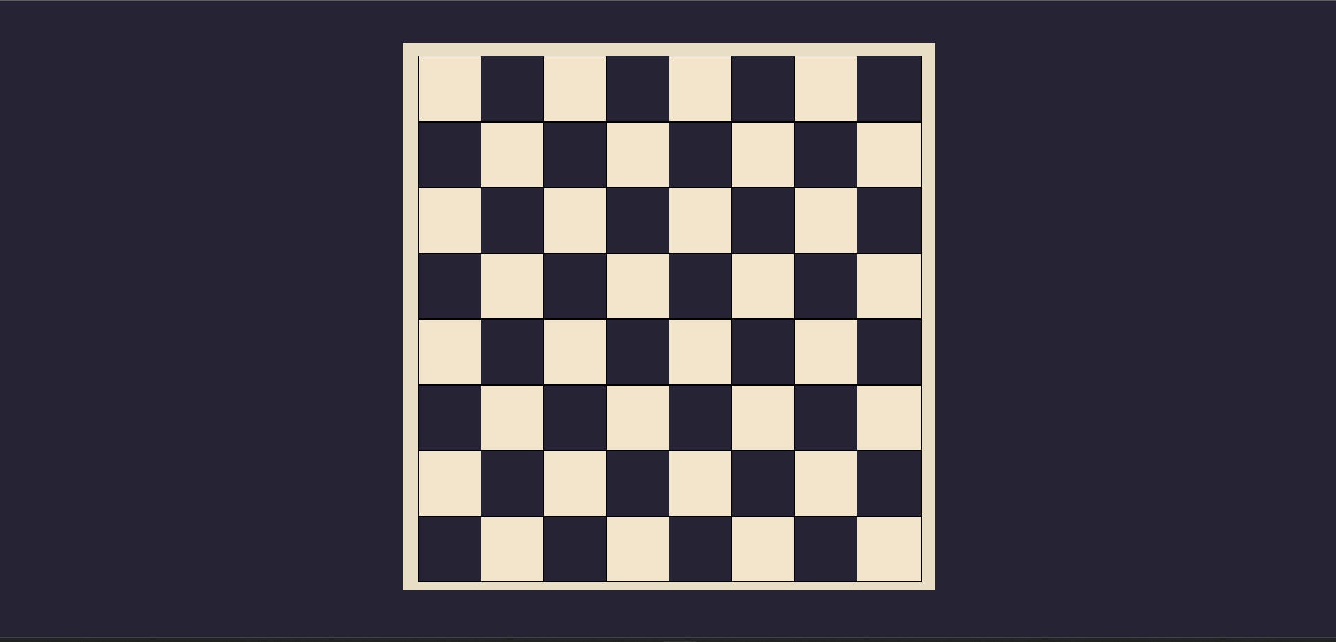
Chess Board Using CSS Grid:
Code: The is code has been uploaded on the git hub:
- OUTPUT:
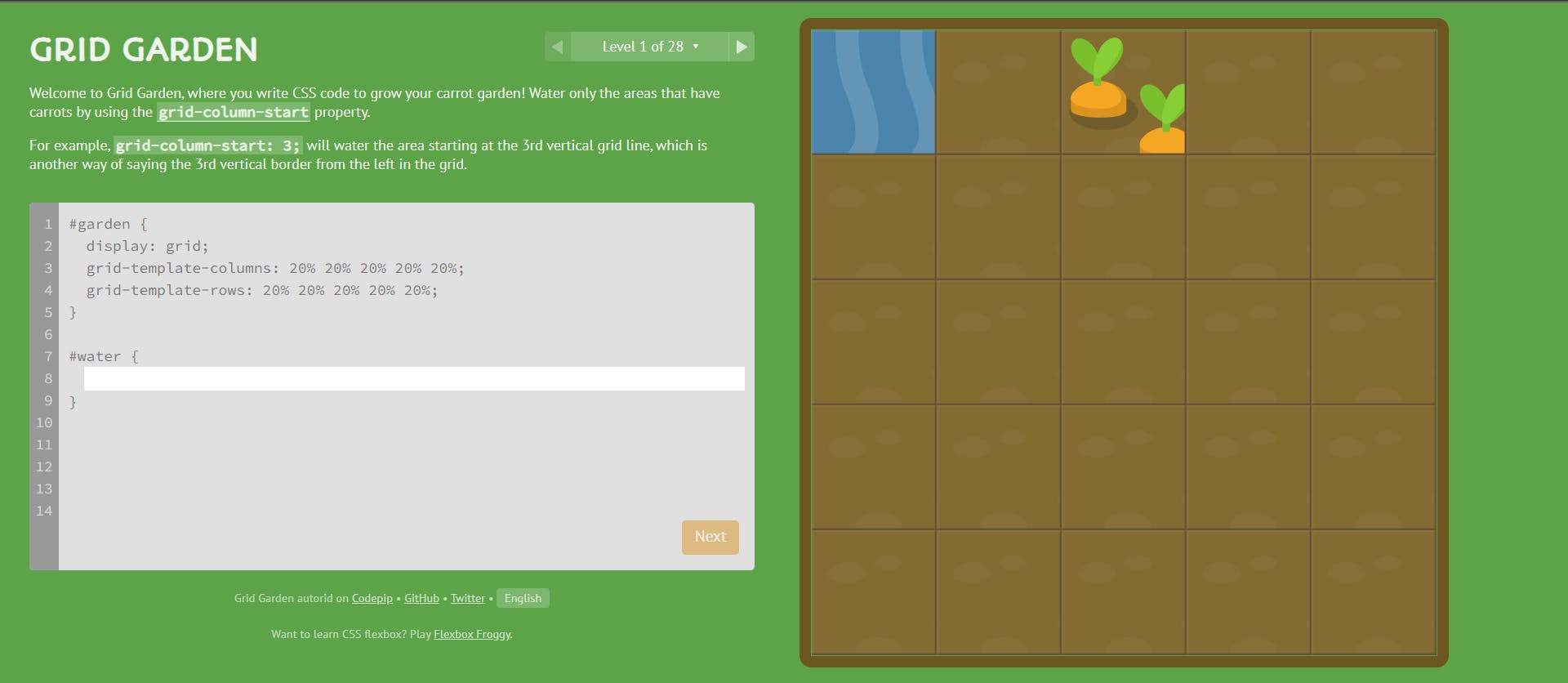
Game For Practicing CSS Grid:
A game for practicing the CSS Grid: Grid Garden