

Introduction
One of the ways to customize the presentation of your web page to a specific range of devices within certain capabilities is the use of Media queries. Media queries can modify the appearance (and even behavior) or a website or app based on a matched set of conditions about the user’s device, browser or system settings.
Media Queries:
These are blocks in CSS that are written according to the criteria of the device they match. The media query is essential in modifying your site in order to make it support a certain screen size and characteristics. They are like filters applied to CSS styles, they make it easier to change styles and adapt to the type of device rendering the content or the features of a particular device. These features include width, height, orientation, hover, and much more.
Syntax:
The basic syntax for media query looks like this as below:
.main-container {
    font-size: 20px;
    flex-wrap: flex;
  }

 /*Syntax when using media queries in your CSS file*/

@media  (max-width: 700px) {
  .main-container {
    font-size: 13px;
    flex-wrap: wrap;
  }
}
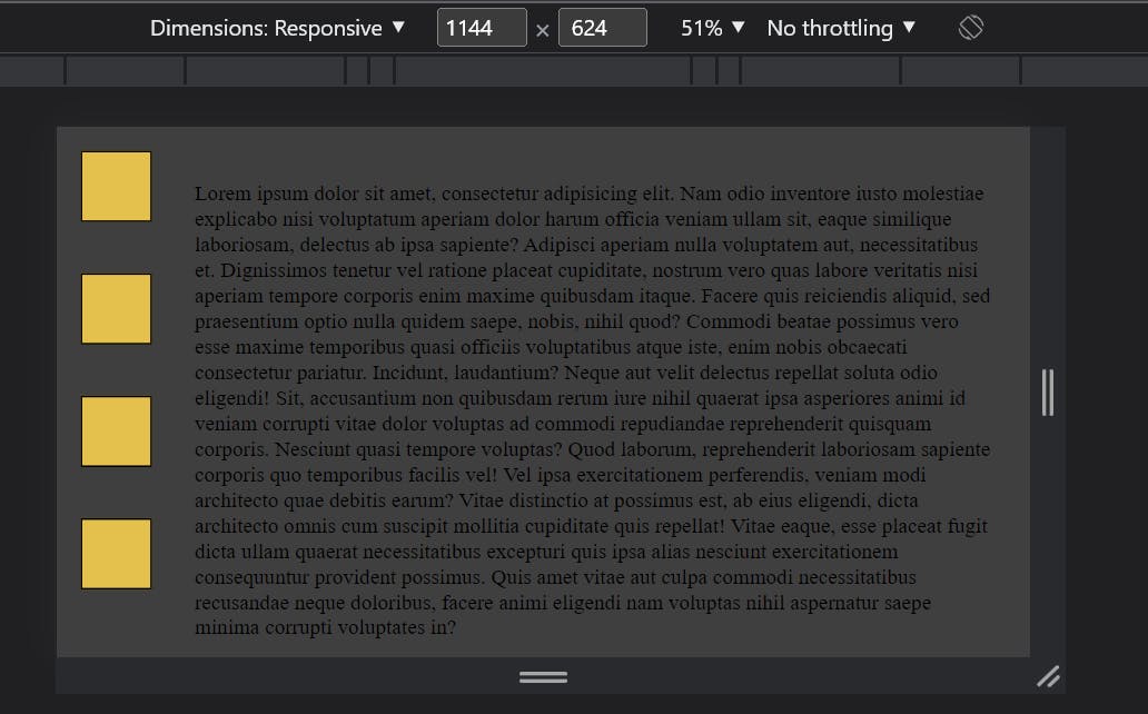
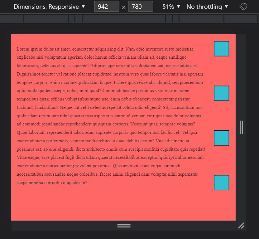
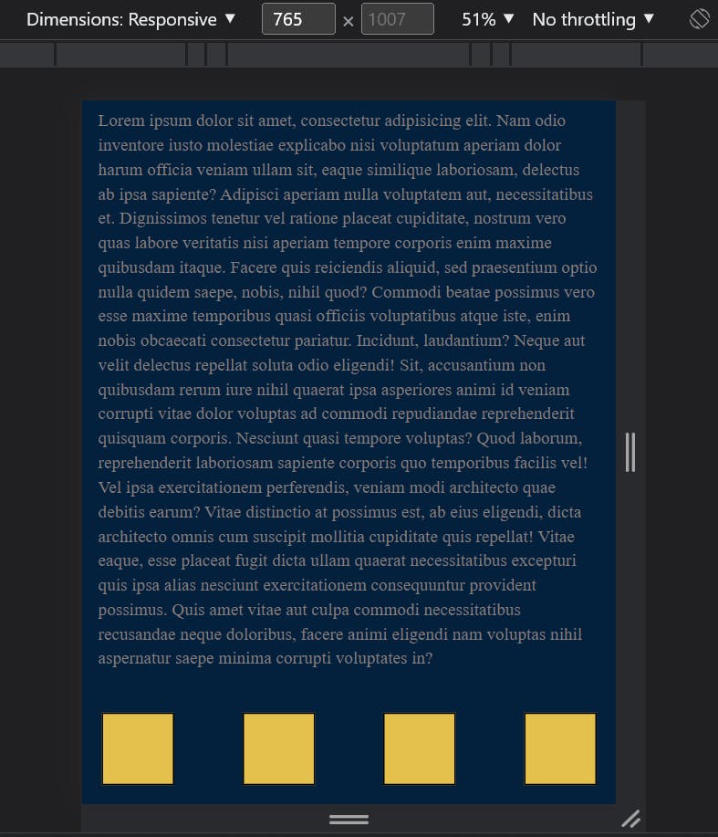
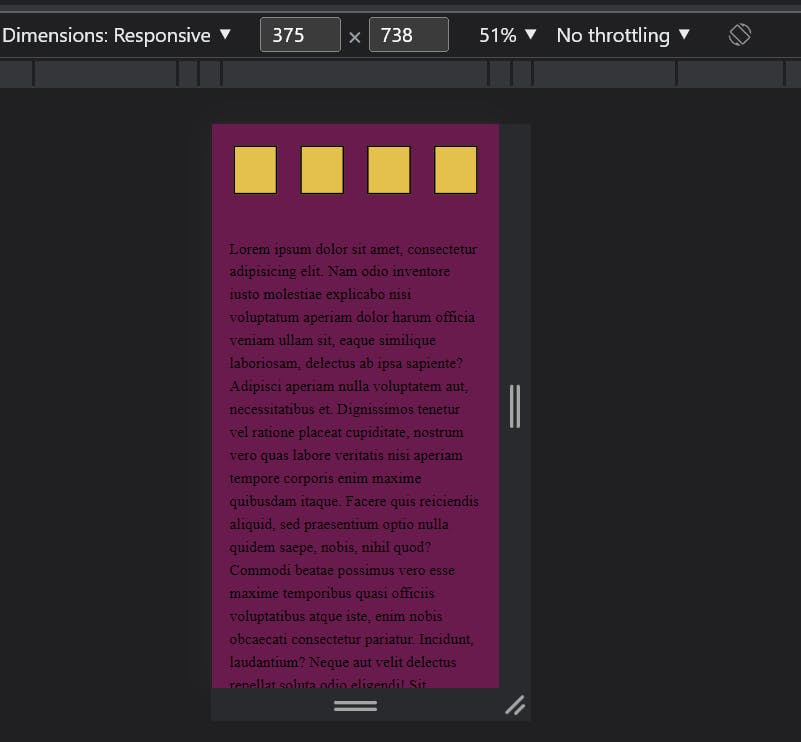
Media queries based on viewport
Media queries allow us to create a responsive experience, which simply means how the same website will behave for different screen sizes.
orientation(portrait or landscape)
width(min-width, max-width)
height(min-width, max-height)
Logical operators
Device-width/device-height
Orientation
Orientation of screen is of two types, either landscape or portrait.
Landscape:
This viewport is usually seen on wider screens (desktops) and appears horizontally.
@media (orientation: landscape) {
     .main-container {
       padding: 30px
    }
  }
Portrait:
This type of orientation is mostly used for mobile devices and is vertical in appearance.
@media (orientation: portrait) {
     .main-container {
       padding: 30px
  }
 }
HEIGHT:
This parameter checks on the height of the viewport which is rarely used since websites take a default vertical position except in cases of shorter viewports. You can either use either the min-height or the max-height.
WIDTH:
This the most frequently used parameter, it checks for the width of the viewport which is normally expected to be fixed according to the viewport. You can either use
min-width: This is applied if the viewport is wider than the number of pixels
max-width: This is applied when the viewport is narrower than the pixels. The browser usually checks the CSS media queries to apply these styles as required.
@media (max-width: 1000px) {
  .lesson {
   max-width: 100%;
   min-width: 100%;
  }
}
Logical operators
They serve as powerful expressions in the Media Queries. There are about 3 major logical operators
AND:
Used to apply more than one condition in media query.
 /* eg. when using the logical operator AND */

@media (max-width:800px) and (orientation: landscape) {
     .main-container {
       padding: 30px
    }
 }
Not:
This logical operator says, work on any other queries except the one being identified.
  /* eg. when using the logical operator  NOT*/
    @media not color (max-width: 800px) {
     aside {
      max-width: 100%;
    }
  }
ONLY:
This logical operator says apply only the query being identified.
/* eg. when using the logical operator ONLY */
    @media only screen (max-width: 800px) {
     .main-container {
       padding: 30px 20px;
      }
   }
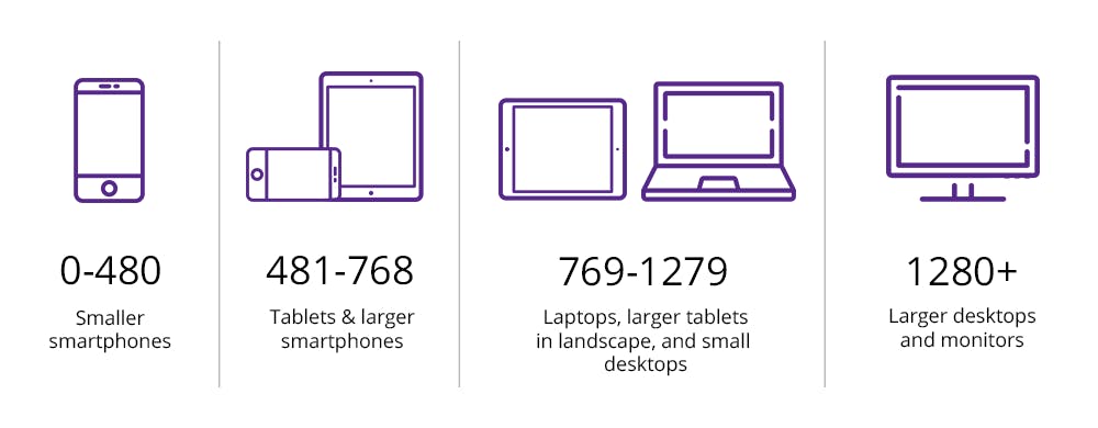
Specific rules for media queries on Larger viewport
- This rule is used for tablets and bigger viewport
@media  (min-width: 768px) {

}
- This rule is used for laptops, small desktop screen, and bigger viewport
@media  (min-width: 992px) {

}
- This rule is used for larger desktop screens only
  @media  (min-width: 1200px) {

   }
Specific rules for media Queries on Smaller viewport
- This is the rule used for mobile-only
@media (max-width: 767px) {

 }
- This rule is used for both mobile and tabs
 @media (max-width: 800px) {

 }
- This is used for laptops, smaller desktops, and smaller viewports ``` @media (max-width: 1000px) {
} ```
GitHub Code link:
## OUTPUT: